Emily Graslie hostsThe Brain Scoop at the Field Museum, which is a YouTube channel dedicated to science and taking visitors behind the scenes at Chicago's Natural History Museum. Recently she posted a video concerning sexual harassment towards female vloggers. I just wanted to share and encourage more people to follow her and like her vlog. Watch her most recent video here. See her full YouTube page here
Tuesday, December 3, 2013

Tuesday, August 20, 2013
15 Down, 22 To Go
I am returned, back from the land of peach trees with 40% of my bucket list Item 1 goal accomplished. What an impeccably enjoyable experience. The Girl With a Pearl Earring is just as beautiful as everyone says, so much so that I think I may have finally found the woman I would turn lesbian for. Well, nah... I don't think it would work out, seeing as I am flesh and blood and she is a compilation of ground up minerals mixed with linseed oil. Not to mention, that portrait of a young Rembrandt was pretty hot...
Anyway, I digress. I began my journey to Atlanta by dropping into my hotel and dropping off my bags. Now, I have had some experiences with some pretty sleazy hotels before, so I wanted to make sure that for this visit to an unfamiliar city I did not end up in another inhospitable accommodation. So I booked a room at the Four Seasons. Sure it's put a pretty nifty pinch on my wallet and I'm going to spend the rest of August eating Ramen noodles and air, but I rarely pamper myself to such a degree. And, hey, after over a year of unemployment and living with my parents and not going anywhere or doing anything, I felt such a treat was perfectly justifiable.
So I dropped off my bags in my FOUR STAR hotel room and rushed downstairs to the front to figure out the best route to the High Museum of Art. I put this very question to the doorman who directed me to a driver who happily volunteered to give me a ride... in the hotel's complimentary Jag. Why, yes sir. I do believe I shall. So I spent a very giddy five minutes in the back seat of a luxury car and chortled with glee when I noticed the gentleman in the next car staring at me; I assume because a young lady with dark features in her own Jag with a driver automatically means Winona Ryder, or something like that.
When I got to the museum I found my fellow registrar and friend Amanda waiting for me. We both wore our pearl earrings for the occasion, because it seemed most appropriate. We each ordered the audio guide and stepped into the elevator that transported us up into Dutch Renaissance heaven.
The exhibit was composed of some of the loveliest Dutch landscapes, still lifes, and portraits I have ever seen. The audio guide put the High's curators and directors right into our ears, filling us in on all the little details one might have missed otherwise. Such as, an awesomely Italian-inspired landscape with a stereotypically hilarious Dutchman peeing on the side of the road. I found a pair of memento mori still lifes especially interesting, both composed with heavy life-is-fleeting symbolism using a shared pocket watch and wine glass. It was the one time where I felt the interpretation failed a little bit, because while there appeared to be a clear connection between the two paintings and the two different artists that created them, no one told us how. Amanda and I could only assume the two artists were of the same school and trained by painting scenes using the same props. We may never find out. We also saw tulip mania, satirically reprimanding tavern scenes, and portraits of rich people in those gravity defying ruffly collars.
Amanda and I also did that thing that registrars do, which was examine how the paintings were mounted, do some quick condition reports of the paintings and frames, and fawn over the acrylic glazing. I swear, I had to contort my head and neck to Linda-Blair-type-proportions to even see the reflection on this plexi. I am convinced it is TRU VUE, my registrar dream acrylic, and I have already contacted the High Art Museum to try and get this confirmed. Hopefully I'll hear back from them soon. I am telling you I am gaga (and not as in Lady, cause that chick's just WAY far out there) for this plexi. I have this perfect dreamland box-fort composed of Gaylord's acid free blue archival boxes with sheets of TRU VUE for the windows. Okay, so I'm out there, but I'm not WAY far out there.
But seriously, TRU VUE is a fantastic product. It is abrasion resistant, UV filtering, static-free, and glare-free. I have even read somewhere that the acrylic is insulating and creates a micro-environment, which is great for paintings that are traveling. I highly recommend this acrylic, but be prepared to pay out the nose for it. It's incredible greatness equates to incredibly high prices. Even so, it's a solid investment for the longevity of artworks because the TRU VUE you may buy will last several lifetimes. I believe that it will last so long into the future that people in flying cars with Mr. Fusions on the back will be coming to see paintings glazed behind the same sheet of acrylic someone puts on their painting tomorrow.
I spent twice the amount of time I spent admiring the acrylic admiring the Girl With a Pearl Earring. Nick-named the Dutch Mona Lisa, and displayed behind almost the same amount of security barriers as Ms. Mona, was Vermeer's famous tronie. I stared at her for so long the optical effect of the image popping out from its dark background occurred on a nearly hypnotic level. I marveled at the sensation that she was staring right at me. I was also sadly surprised at just how much alligatoring she appeared to have, though it may not have been so bad; perhaps just extensive crackle. It was difficult to do a proper condition report with so many barriers and plexi between us, but I'd say she's very stable and still incredibly beautiful.
My only other critique for this otherwise fantastic exhibit was how empty the gallery directly before the gallery with the Girl With a Pearl Earring was. There were some rather great, large-scale wall decals which explained Vermeer's technique, the camera obscura, the identity of Girl With a Pearl, and some of his other artworks. But the floor was wide open and empty and there were no other paintings on the walls. In fact, one rather large temporary wall was completely blank. Someone must have felt Girl With a Pearl also needed just as much elbow room around her as Ms. Mona has. I personally just feel bad that Girl With a Pearl has to spend the next five weeks staring at a blank wall.
I made Amanda linger for a good ten to fifteen minutes while I admired this 15 of my 37. Then I bought a magnet, we explored the rest of the High, and departed for lunch.
I suppose I should mention that I have spent more time describing TRU VUE for you because I can; the Girl With a Pearl Earring you must see for yourself.
Amanda and I had a lovely lunch bemoaning our registrar woes, because lets face it folks, the only people who truly understand are other registrars. Then we took a memorial photograph and parted ways. I walked back to my hotel, deciding not to call my driver seeing as I was half a block away and it would be kind of silly to have him make one right turn to come pick me up. I spent the rest of my trip enjoying my hotel (because I paid for it and I was gonna get my monies worth!), texting friends and family the picture of me with my face sticking through a Girl With a Pearl Earring cut-out, and trying to decide which Vermeer to visit next. I don't expect anymore of them to be in my neck of the woods anytime soon, so I might have to plan a trip to New York soon... or Europe... perhaps Dublin. ^_^
Anyway, I digress. I began my journey to Atlanta by dropping into my hotel and dropping off my bags. Now, I have had some experiences with some pretty sleazy hotels before, so I wanted to make sure that for this visit to an unfamiliar city I did not end up in another inhospitable accommodation. So I booked a room at the Four Seasons. Sure it's put a pretty nifty pinch on my wallet and I'm going to spend the rest of August eating Ramen noodles and air, but I rarely pamper myself to such a degree. And, hey, after over a year of unemployment and living with my parents and not going anywhere or doing anything, I felt such a treat was perfectly justifiable.
So I dropped off my bags in my FOUR STAR hotel room and rushed downstairs to the front to figure out the best route to the High Museum of Art. I put this very question to the doorman who directed me to a driver who happily volunteered to give me a ride... in the hotel's complimentary Jag. Why, yes sir. I do believe I shall. So I spent a very giddy five minutes in the back seat of a luxury car and chortled with glee when I noticed the gentleman in the next car staring at me; I assume because a young lady with dark features in her own Jag with a driver automatically means Winona Ryder, or something like that.
When I got to the museum I found my fellow registrar and friend Amanda waiting for me. We both wore our pearl earrings for the occasion, because it seemed most appropriate. We each ordered the audio guide and stepped into the elevator that transported us up into Dutch Renaissance heaven.
The exhibit was composed of some of the loveliest Dutch landscapes, still lifes, and portraits I have ever seen. The audio guide put the High's curators and directors right into our ears, filling us in on all the little details one might have missed otherwise. Such as, an awesomely Italian-inspired landscape with a stereotypically hilarious Dutchman peeing on the side of the road. I found a pair of memento mori still lifes especially interesting, both composed with heavy life-is-fleeting symbolism using a shared pocket watch and wine glass. It was the one time where I felt the interpretation failed a little bit, because while there appeared to be a clear connection between the two paintings and the two different artists that created them, no one told us how. Amanda and I could only assume the two artists were of the same school and trained by painting scenes using the same props. We may never find out. We also saw tulip mania, satirically reprimanding tavern scenes, and portraits of rich people in those gravity defying ruffly collars.
Amanda and I also did that thing that registrars do, which was examine how the paintings were mounted, do some quick condition reports of the paintings and frames, and fawn over the acrylic glazing. I swear, I had to contort my head and neck to Linda-Blair-type-proportions to even see the reflection on this plexi. I am convinced it is TRU VUE, my registrar dream acrylic, and I have already contacted the High Art Museum to try and get this confirmed. Hopefully I'll hear back from them soon. I am telling you I am gaga (and not as in Lady, cause that chick's just WAY far out there) for this plexi. I have this perfect dreamland box-fort composed of Gaylord's acid free blue archival boxes with sheets of TRU VUE for the windows. Okay, so I'm out there, but I'm not WAY far out there.
But seriously, TRU VUE is a fantastic product. It is abrasion resistant, UV filtering, static-free, and glare-free. I have even read somewhere that the acrylic is insulating and creates a micro-environment, which is great for paintings that are traveling. I highly recommend this acrylic, but be prepared to pay out the nose for it. It's incredible greatness equates to incredibly high prices. Even so, it's a solid investment for the longevity of artworks because the TRU VUE you may buy will last several lifetimes. I believe that it will last so long into the future that people in flying cars with Mr. Fusions on the back will be coming to see paintings glazed behind the same sheet of acrylic someone puts on their painting tomorrow.
I spent twice the amount of time I spent admiring the acrylic admiring the Girl With a Pearl Earring. Nick-named the Dutch Mona Lisa, and displayed behind almost the same amount of security barriers as Ms. Mona, was Vermeer's famous tronie. I stared at her for so long the optical effect of the image popping out from its dark background occurred on a nearly hypnotic level. I marveled at the sensation that she was staring right at me. I was also sadly surprised at just how much alligatoring she appeared to have, though it may not have been so bad; perhaps just extensive crackle. It was difficult to do a proper condition report with so many barriers and plexi between us, but I'd say she's very stable and still incredibly beautiful.

My only other critique for this otherwise fantastic exhibit was how empty the gallery directly before the gallery with the Girl With a Pearl Earring was. There were some rather great, large-scale wall decals which explained Vermeer's technique, the camera obscura, the identity of Girl With a Pearl, and some of his other artworks. But the floor was wide open and empty and there were no other paintings on the walls. In fact, one rather large temporary wall was completely blank. Someone must have felt Girl With a Pearl also needed just as much elbow room around her as Ms. Mona has. I personally just feel bad that Girl With a Pearl has to spend the next five weeks staring at a blank wall.
I made Amanda linger for a good ten to fifteen minutes while I admired this 15 of my 37. Then I bought a magnet, we explored the rest of the High, and departed for lunch.
I suppose I should mention that I have spent more time describing TRU VUE for you because I can; the Girl With a Pearl Earring you must see for yourself.
Amanda and I had a lovely lunch bemoaning our registrar woes, because lets face it folks, the only people who truly understand are other registrars. Then we took a memorial photograph and parted ways. I walked back to my hotel, deciding not to call my driver seeing as I was half a block away and it would be kind of silly to have him make one right turn to come pick me up. I spent the rest of my trip enjoying my hotel (because I paid for it and I was gonna get my monies worth!), texting friends and family the picture of me with my face sticking through a Girl With a Pearl Earring cut-out, and trying to decide which Vermeer to visit next. I don't expect anymore of them to be in my neck of the woods anytime soon, so I might have to plan a trip to New York soon... or Europe... perhaps Dublin. ^_^
Sunday, August 4, 2013
Pearl Earring is in Atlanta
My father tells me that I am too young to have a bucket list, but I argue that I am just getting a head start. One of my bucket list items is to see every known Vermeer in the world. Thus far I have seen 14 of 37 (including disputed paintings):
Christ in the House of Martha and Mary
A Girl Asleep
Woman with a Lute
Young Woman with a Water Pitcher
A Woman Holding a Balance
A Lady Writing a Letter
Portrait of a Young Woman
Girl With a Red Hat (disputed)
The Astronomer
The Lacemaker
The Allegory of Faith
Lady Standing at a Virginal
Lady Seated at a Virginal
Girl with a Flute (disputed)
And now I'm going to get that number up to 15. The most iconic Vermeer of all:
Girl With a Pearl Earring
I have my trip booked for Atlanta and I cannot wait to see her! She's only there until September 23rd and then she moves on to New York before returning to Europe. Anyone who gets chance should definitely go, seeing as she doesn't get out of the Hague that often. I'll be sure to share more about the painting and exhibition when I get back.
Christ in the House of Martha and Mary

A Girl Asleep

Woman with a Lute

Young Woman with a Water Pitcher

A Woman Holding a Balance

A Lady Writing a Letter

Portrait of a Young Woman

Girl With a Red Hat (disputed)

The Astronomer

The Lacemaker
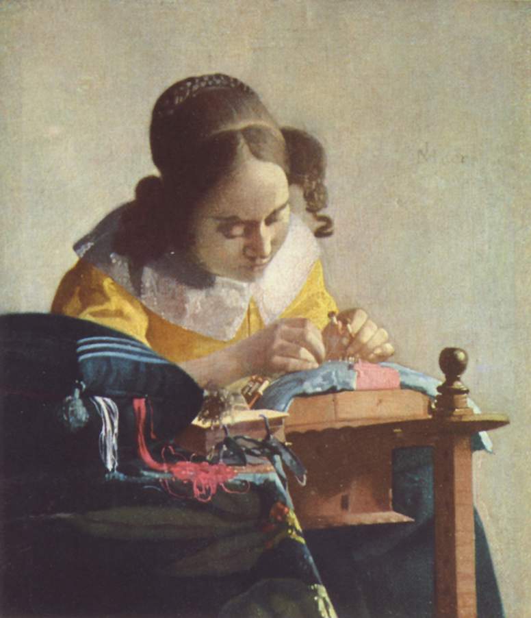
The Allegory of Faith

Lady Standing at a Virginal

Lady Seated at a Virginal

Girl with a Flute (disputed)

And now I'm going to get that number up to 15. The most iconic Vermeer of all:
Girl With a Pearl Earring
I have my trip booked for Atlanta and I cannot wait to see her! She's only there until September 23rd and then she moves on to New York before returning to Europe. Anyone who gets chance should definitely go, seeing as she doesn't get out of the Hague that often. I'll be sure to share more about the painting and exhibition when I get back.
Sunday, July 28, 2013
It's Been A While
Restarting my blog is kind of like stepping out of a six-month whirlwind of loan forms, catalog records, and acid free tissue paper. I am not entirely sure where to begin. It's even more difficult because I cannot actually blog about what I do at my job. Working for a metropolitan government museum there are very strict rules about social networking sites. Everything must be approved and double-approved, so rather than go through that mess of paperwork I think I'll continue my adventures by sharing tales of my brave exploits to other museums and my opinions on major developments in the museum world. Maybe even some fun tales about exploring Nashville, TN.
I apologize for such a long delay. Moving to Nashville and settling into a new job and making new friends has taken up the vast majority of my time, and it's all been so wonderfully exhausting. In six months I have gained so much more work experience and engaged in several new amazing projects and activities. I've coordinated loans and gone on my first courier trip and installed exhibits and deinstalled exhibits and went to AAM and joined a book club and gone swing dancing and run a 5K (well, I ran most of it). Whew!
So here we are at the continuation of an adventure. Sit back and enjoy the read.
I apologize for such a long delay. Moving to Nashville and settling into a new job and making new friends has taken up the vast majority of my time, and it's all been so wonderfully exhausting. In six months I have gained so much more work experience and engaged in several new amazing projects and activities. I've coordinated loans and gone on my first courier trip and installed exhibits and deinstalled exhibits and went to AAM and joined a book club and gone swing dancing and run a 5K (well, I ran most of it). Whew!
So here we are at the continuation of an adventure. Sit back and enjoy the read.
Sunday, January 27, 2013
Numbering Objects
Numbering objects is an important part of collections care and documentation. It can also be a bit nerve-racking, cause you don't (and I most certainly don't) want to do it incorrectly. In addition to the standard need to handle objects safely, there is also the need to number things properly and legibly. The object numbers are no good if future collections managers cannot find them, read them, or even alter them. They need to be permanent but removable; an oxymoron I know, like caffeine free Mountain Dew, but that's the way object numbers should work. Here are some useful links, that I found most helpful, about applying numbers to objects:
http://www.collectioncare.org/cci/ccin.html
http://www.powerhousemuseum.com/pdf/preservation/A_Simple_Guide_to_Lablling_Museum_Objects.pdf
http://www.collectioncare.org/cci/ccin.html
http://www.powerhousemuseum.com/pdf/preservation/A_Simple_Guide_to_Lablling_Museum_Objects.pdf
Monday, December 31, 2012
Intermission
Greetings one and all from the buckle of the bible belt. Apologies for the continued lack of postings. I have been extremely busy with moving and preparing for the new job. Once I have settled and start working, I'll be back to blogging. I promise!
Cheers all and Happy New Year!
Here is some intermission music. Enjoy!
Cheers all and Happy New Year!
Here is some intermission music. Enjoy!
Saturday, December 1, 2012
A New Job!!!
Hi all! I apologize for the lack of recent postings. I have been extremely busy lately with interviews and trips, and I have some very happy news. I finally landed the dream job. I am the new Registrar at the Parthenon in Nashville, TN. I am so happy and excited that all of my hard work has finally paid off and I look forward to starting this exciting new chapter in my life. Thank you to all of my readers and friends for sticking in there with me and sharing your comments.
Now here we are at the start of a new adventure. Nashville here I come!
Now here we are at the start of a new adventure. Nashville here I come!
Saturday, November 10, 2012
Federico Barocci: Renaissance Master
In the summer of 2008, oh so many moons ago, I interned at the Saint Louis Art Museum as a curatorial research assistant. I spent three months reading and thinking of nothing but Federico Barroci, an Italian Renaissance artist who was born and died in Urbino, Italy (c. 1526 - 1612). While he is not a widely known artist in modern times, Barocci was one of the most influential artists of the 16th and 17th centuries. His mastery of color and the vast collection of preparatory drawings he left behind, show him to be one of the most creative and methodical artists of his time. Due to this, Dr. Judith Mann of the Saint Louis Art Museum decided it was high time that this relatively unknown master get a little bit of the spotlight. After many years of planning and preparation on behalf of museum staff, external curators, and dozens of interns, the show is finally here. Read more about it at the online at Federico Barocci: Renaissance Master.
After four years of waiting, I was happy to see Judy's show finally come to fruition. I made my way up to the museum Thursday to see the exhibit with great anticipation and I was not disappointed. I began by taking up my audio tour and entered into the introductory gallery. Here I was met by a self-portrait of the man himself. His soft brown eyes glowed out at me, inviting and warm, and if I hadn't of liked him already his portrait would have definitely won me over. The way he captured his own gaze in oils and pigments shows, in many ways, how he saw the world and thus why he portrayed it the way he did in his art. The audio guide introduces the viewer to Barocci and the show, as well as all the contributors and sponsors of the exhibit. Then I was introduced to the first of many Barocci preparatory drawings, over a hundred, which make up the vast majority of the show.
The large number of drawings and cartoons in the show are, in my opinion, what make it so great. While it is always awe inspiring to see a completed work on a grand scale, I personally have always been more interested in the creative process of such grand pieces. I like to see how the characters of each painting were developed and shaped. This is why Barocci is the best subject for such a show, since he has left behind probably more preparatory drawings than any other Renaissance master. Here you can see Barocci's processes, which figures he struggled with and how saints came to their final poses. It's almost like following a timeline of drawings until you come to the culmination; the finished painting, fantastical and towering over you.
Many of Barocci's works are devotional alter pieces and, while looking up at these beautiful compositions, somewhere inside me a younger Maggie in her Catholic school uniform was wondering if she should genuflect. The works and their drawings are astoundingly beautiful. Barocci had this great way of portraying figures' faces, where they seem to glow with an aura all their own. One particularly great set of drawings near La Madonna del Gatto (The Madonna of the Cat), show how the artist developed such a radiant face for the Virgin Mary; first starting with a sketch of an actual model and next to that another sketch where the woman's head has been softened and idealized. His glowing characters are often shown in very innovative poses, which is one of the reasons Barocci was such a groundbreaking artist. Despite this, there is also evidence of his taking ideas from previous masters, such as Raphael (Raffaello Sanzio), also from Urbino. This can be seen when comparing Barocci's Entombment with Raphael's The Deposition (not included in show). And these are just a couple of examples of some of Barocci's works on display in this exhibition.
The thoughtfully planned layout of the exhibit allows visitors to stroll through and take in all the drawings and their paintings, one at a time. The audio guide provides information on each painting and covers anywhere from three to five drawings per piece. The exhibit also has ample text in the form large panels and individual labels. In some areas, magnifying glasses are provided that enable visitors to get a closer look at prints and drawings. There is also an information video in one of the galleries, where curators and museum directors explain more about Barocci, his life, his techniques, and his art. I can grantee that by the time the visitor exits this exhibit they will know so much more about the artist and his process. So much so, they'll be wondering how they had never even heard of Barocci in the first place.
Federico Barocci: Renaissance Master is an excellent exhibition that allows visitors to not only look at exceptional devotional artworks but also allows them to see how those artworks were developed. It displays Barocci's skills as a painter, printer, and draftsman. I highly recommend this exhibit to anyone who is passionate about art and the artistic process.
After four years of waiting, I was happy to see Judy's show finally come to fruition. I made my way up to the museum Thursday to see the exhibit with great anticipation and I was not disappointed. I began by taking up my audio tour and entered into the introductory gallery. Here I was met by a self-portrait of the man himself. His soft brown eyes glowed out at me, inviting and warm, and if I hadn't of liked him already his portrait would have definitely won me over. The way he captured his own gaze in oils and pigments shows, in many ways, how he saw the world and thus why he portrayed it the way he did in his art. The audio guide introduces the viewer to Barocci and the show, as well as all the contributors and sponsors of the exhibit. Then I was introduced to the first of many Barocci preparatory drawings, over a hundred, which make up the vast majority of the show.
The large number of drawings and cartoons in the show are, in my opinion, what make it so great. While it is always awe inspiring to see a completed work on a grand scale, I personally have always been more interested in the creative process of such grand pieces. I like to see how the characters of each painting were developed and shaped. This is why Barocci is the best subject for such a show, since he has left behind probably more preparatory drawings than any other Renaissance master. Here you can see Barocci's processes, which figures he struggled with and how saints came to their final poses. It's almost like following a timeline of drawings until you come to the culmination; the finished painting, fantastical and towering over you.
Many of Barocci's works are devotional alter pieces and, while looking up at these beautiful compositions, somewhere inside me a younger Maggie in her Catholic school uniform was wondering if she should genuflect. The works and their drawings are astoundingly beautiful. Barocci had this great way of portraying figures' faces, where they seem to glow with an aura all their own. One particularly great set of drawings near La Madonna del Gatto (The Madonna of the Cat), show how the artist developed such a radiant face for the Virgin Mary; first starting with a sketch of an actual model and next to that another sketch where the woman's head has been softened and idealized. His glowing characters are often shown in very innovative poses, which is one of the reasons Barocci was such a groundbreaking artist. Despite this, there is also evidence of his taking ideas from previous masters, such as Raphael (Raffaello Sanzio), also from Urbino. This can be seen when comparing Barocci's Entombment with Raphael's The Deposition (not included in show). And these are just a couple of examples of some of Barocci's works on display in this exhibition.
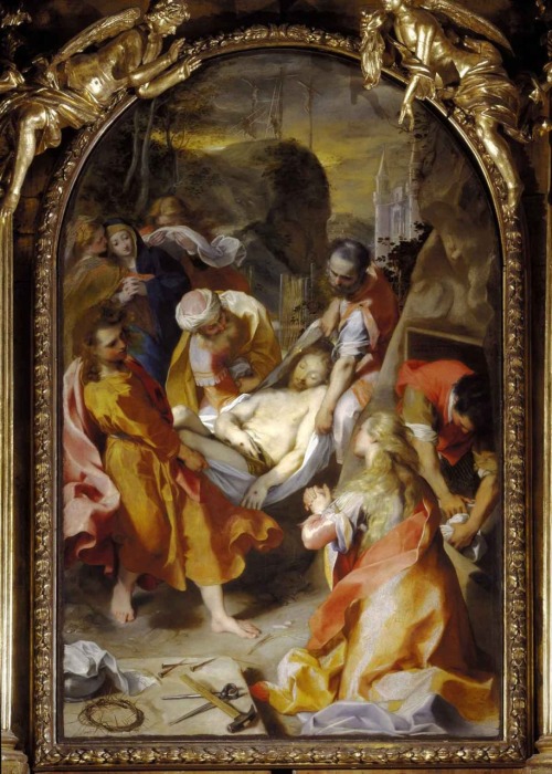
The thoughtfully planned layout of the exhibit allows visitors to stroll through and take in all the drawings and their paintings, one at a time. The audio guide provides information on each painting and covers anywhere from three to five drawings per piece. The exhibit also has ample text in the form large panels and individual labels. In some areas, magnifying glasses are provided that enable visitors to get a closer look at prints and drawings. There is also an information video in one of the galleries, where curators and museum directors explain more about Barocci, his life, his techniques, and his art. I can grantee that by the time the visitor exits this exhibit they will know so much more about the artist and his process. So much so, they'll be wondering how they had never even heard of Barocci in the first place.
Federico Barocci: Renaissance Master is an excellent exhibition that allows visitors to not only look at exceptional devotional artworks but also allows them to see how those artworks were developed. It displays Barocci's skills as a painter, printer, and draftsman. I highly recommend this exhibit to anyone who is passionate about art and the artistic process.
Sunday, November 4, 2012
Remember to Vote Tuesday!
Hi all and apologies for the lack of recent posts. I have spent a lot of time recently working and researching political candidates. Allow me to take a moment to encourage everyone to vote and to be an informed voter. Every election is important and folks should take the time to carefully research and consider each candidate.
I also wanted to share what has been my mantra/power song this election season. This one's for the ladies! Huzzah for 92 years of women voting! Sister Suffragette
I also wanted to share what has been my mantra/power song this election season. This one's for the ladies! Huzzah for 92 years of women voting! Sister Suffragette
Monday, October 22, 2012
Dutch Museum Art Theft
Today I read an article concerning the recent art theft of seven paintings from Rotterdam's Kruntshal Museum that very much reminded me of a blog post I wrote back in May entitled Museum Heists in Movies. You can read the article at cbsnews.com. They even make a Pierce Brosnan reference. Two more articles, one in the Detroit Free Press entitled Dutch Art Thieves were no 'Ocean's 11' Team, and the other in the Washington Post entitled Why do people steal art?, also carry a similar message.
The main point being that museum thefts are not high-tech or cool and art thieves are not classy and sophisticated, they are thugs who steal and break things.
The main point being that museum thefts are not high-tech or cool and art thieves are not classy and sophisticated, they are thugs who steal and break things.
Saturday, October 20, 2012
Some Helpful Cells and Formulas
Whenever asked about my computer skills and experience with Microsoft Office software, I am always quick to declare myself an Excel Wizard. Wingardium Leviosa! Alohomora! Expecto Patronum! Well, not that kind of wizard, just a person who is very good with spreadsheets. And I'm pretty sure they don't teach a computer course at Hogwarts.
My expertise with Excel developed when I worked as an accounting assistant/job cost accountant during the year in between undergrad and grad school. I utilized the program to track budgets, create invoices, assemble bills, and make lists. I took everything I learned of formulas and worksheets at my job and began utilizing them at home to track my personal budget and all my savings for grad school. Once I began school, my skills were once again called upon when I was elected to serve as Treasurer for the student exhibition team. I would like to boast about some of my cap feathers at this point and say that not only did we complete our project on budget, but I also successfully obtained some extra grant funding for our group and handled all of that paperwork as well. During an internship, I used Excel to create a detailed inventory list of a collections storage room and included a column of cells that contained thumbnail images of the artifacts. Now I utilize Excel in the gift shop at Laumeier Sculpture Park, creating spreadsheets to input visitor survey data and then using those to produce pages with statistics and graphs. These statistics are super helpful when it's time to apply for grants. We also use it to enter membership information and to keep track of our iPod rentals.
Excel has been a very important tool of mine for the last couple of years and there is a very good reason for this: Excel is a super useful tool for museums. It is clear from the paragraph above that it can be utilized for a number of different things by any department. So I just wanted to share some of the things that I have picked up along the way:
1.) First, if you are trying to figure out what formula you need or how to enter it, Microsoft has a great webpage with helpful tips called Examples of Commonly used Formulas. Hitting the question mark on the Menu bar also opens a window with links to info on formulas and tables.
2.) Remember there are three ways to enter any given Excel formula - select from drop down options on the Menu, manually type, or just copy and paste/drag from another cell.
3.) If your numbers do not add up correctly and you know all the data was entered right, then the problem is one of the formulas. Sometimes this occurs because you copied or dragged a formula; the program will automatically start ascending numerals (counting upwards) from your original number. Because of this, I often find it is best to manually type in all the formulas the first time I create any spreadsheet, just to make sure they are correct.
4.) Excel is very expansive with all its columns, rows, and cells, but it still has its limitations, and sometimes you just have to get creative.
5.) Interlinked multiple spreadsheets, instead of having all your information on just one sheet, it much more organized and a huge time saver.
6.) While you can include high resolution images in a spreadsheet, it is best to keep them low resolution so the file size is smaller.
7.) Excel can be used as a collections database, but Microsoft Access is better for this.
8.) Most museum database programs are already designed to import and export data from spreadsheets.
9.) Pie charts are the best (and I'm not just saying that cause I like pie).
My expertise with Excel developed when I worked as an accounting assistant/job cost accountant during the year in between undergrad and grad school. I utilized the program to track budgets, create invoices, assemble bills, and make lists. I took everything I learned of formulas and worksheets at my job and began utilizing them at home to track my personal budget and all my savings for grad school. Once I began school, my skills were once again called upon when I was elected to serve as Treasurer for the student exhibition team. I would like to boast about some of my cap feathers at this point and say that not only did we complete our project on budget, but I also successfully obtained some extra grant funding for our group and handled all of that paperwork as well. During an internship, I used Excel to create a detailed inventory list of a collections storage room and included a column of cells that contained thumbnail images of the artifacts. Now I utilize Excel in the gift shop at Laumeier Sculpture Park, creating spreadsheets to input visitor survey data and then using those to produce pages with statistics and graphs. These statistics are super helpful when it's time to apply for grants. We also use it to enter membership information and to keep track of our iPod rentals.
Excel has been a very important tool of mine for the last couple of years and there is a very good reason for this: Excel is a super useful tool for museums. It is clear from the paragraph above that it can be utilized for a number of different things by any department. So I just wanted to share some of the things that I have picked up along the way:
1.) First, if you are trying to figure out what formula you need or how to enter it, Microsoft has a great webpage with helpful tips called Examples of Commonly used Formulas. Hitting the question mark on the Menu bar also opens a window with links to info on formulas and tables.
2.) Remember there are three ways to enter any given Excel formula - select from drop down options on the Menu, manually type, or just copy and paste/drag from another cell.
3.) If your numbers do not add up correctly and you know all the data was entered right, then the problem is one of the formulas. Sometimes this occurs because you copied or dragged a formula; the program will automatically start ascending numerals (counting upwards) from your original number. Because of this, I often find it is best to manually type in all the formulas the first time I create any spreadsheet, just to make sure they are correct.
4.) Excel is very expansive with all its columns, rows, and cells, but it still has its limitations, and sometimes you just have to get creative.
5.) Interlinked multiple spreadsheets, instead of having all your information on just one sheet, it much more organized and a huge time saver.
6.) While you can include high resolution images in a spreadsheet, it is best to keep them low resolution so the file size is smaller.
7.) Excel can be used as a collections database, but Microsoft Access is better for this.
8.) Most museum database programs are already designed to import and export data from spreadsheets.
9.) Pie charts are the best (and I'm not just saying that cause I like pie).
Saturday, October 13, 2012
Yellowism
A recent incident at the Tate Modern in London has me feeling a bit more wary of any patron that gets too close to artworks at the Kemper Art Museum or Laumeier Sculpture Park. On Sunday, October 7th, a man named Valdimir Umanets walked up to Rothko's Black on Maroon and wrote on it: "Vladimir Umanets, A Potential Piece of Yellowism." Mr. Umanets, in a BBC article, claims that his actions are not vandalism and will make the artwork more valuable.
Curious, I tried to find out what exactly Yellowism is. Googling the term instantly brings up a website and blog created by Valdimir Umanets and Marcin Lodyga, which explains their artistic philosophies. The Manifesto of Yellowism, written in a bold black font against a sharp white background, explains (well sort of) what Yellowism is. I think the basic point the proponents of this philosophy are trying to get across is: what makes art, art is the context in which art exists. It's kinda like saying the only reason a Piasco painting is art is because someone hangs it up in an art museum. Statements such as "We believe that the context for works of art is already art," and "Yellowism can be presented in only yellowistic chambers," lean me towards this argument. There are, however, other statements, such as "Yellowism is not art or anti-art," and "Interpreting Yellowism as art or being about something other than just yellow deprives Yellowism of its only purpose," that refute this. So the questions remain: what makes Yellowism yellow? What makes art art? How many licks does it take to get to the center of a Tootsie Pop? The world may never know.
I love art and art historical debate just as much as the next emerging museum professional. I think the concepts of Yellowism are interesting (though infuriating and possibly complete hokum) and people should be allowed to put forth these theories and discuss them in an open forum. Still, I do not approve of the defacement of another's artwork in order to bring these philosophies to light. Valdimir Umanets's actions seem to show a lack of respect for other artists and art movements. His actions, though, he feels are justified by the philosophies of his own movement, which make it acceptable and even an honor to bestow his markings on Rothko's painting. If Rothko were alive I wonder what he would say about it. What if Umanets had chosen a living artist's work to write on? Choosing an artist who can no longer speak for himself seems to be a way of avoiding artistic conflict and responsibility, and also seems very high-handed; that he has done this deceased artist a favor, who cannot say whether or not he wants such a condescending favor in the first place.
This is not a first instance of a contemporary artist claiming their destructive actions are in themselves art. In 2007 a female artist in France vandalized a Cy Twombly by kissing it and leaving her lipstick smudged on the white canvas. She later claimed that she felt the artist had "left the canvas white" for her and that "this red stain is a testimony to this moment, to the power of art." As far as I can tell, Twombly never shared his personal opinions concerning this act, but the French courts did find the woman guilty of vandalism and fined her.
While researching other examples of art vandalism I came across an article, entitled Please Refrain from Taking a Hammer to the Michelangelo, in the Arts & Entertainment section of the Wall Street Journal. It briefly discusses the Cy Twombly and current Tate Modern incidents and others like them. It also expresses my opinion about artists who vandalize art; that it is first and foremost a security issue that can ruin the visitor experiences of others. Actions like this lead to tightened security measures that can limit and even eliminate a visitor's ability to fully engage with and enjoy an artwork. Just think of every person you have ever heard complain (and I am certain you have) about all the barriers and bullet-proof glass around the Mona Lisa. No one seems to notice her anymore, just her security detail. I think no artist or philosophy about art should interfere with how others are allowed to view and interact with art.
I will not say that proponents of Yellowism do not have the right to share their ideas, in fact I think such ideas lead to fascinating scholarly debate. But no idea or philosophy should be allowed to force itself onto or brand the artistic concepts or creations of others. And all philosophical debates aside, it is also important to remember the simple fact that the damage of someone else's property is wrong and legally punishable. Black on Maroon does not belong to Umanets, it belongs to the Tate Modern, and he had no right to make his mark on it and the museum has every right to prosecute.
At the end of the day I think all that Yellowism has really accomplished is ruining the museum experiences of others and making my job a little bit more stressful.
Curious, I tried to find out what exactly Yellowism is. Googling the term instantly brings up a website and blog created by Valdimir Umanets and Marcin Lodyga, which explains their artistic philosophies. The Manifesto of Yellowism, written in a bold black font against a sharp white background, explains (well sort of) what Yellowism is. I think the basic point the proponents of this philosophy are trying to get across is: what makes art, art is the context in which art exists. It's kinda like saying the only reason a Piasco painting is art is because someone hangs it up in an art museum. Statements such as "We believe that the context for works of art is already art," and "Yellowism can be presented in only yellowistic chambers," lean me towards this argument. There are, however, other statements, such as "Yellowism is not art or anti-art," and "Interpreting Yellowism as art or being about something other than just yellow deprives Yellowism of its only purpose," that refute this. So the questions remain: what makes Yellowism yellow? What makes art art? How many licks does it take to get to the center of a Tootsie Pop? The world may never know.
I love art and art historical debate just as much as the next emerging museum professional. I think the concepts of Yellowism are interesting (though infuriating and possibly complete hokum) and people should be allowed to put forth these theories and discuss them in an open forum. Still, I do not approve of the defacement of another's artwork in order to bring these philosophies to light. Valdimir Umanets's actions seem to show a lack of respect for other artists and art movements. His actions, though, he feels are justified by the philosophies of his own movement, which make it acceptable and even an honor to bestow his markings on Rothko's painting. If Rothko were alive I wonder what he would say about it. What if Umanets had chosen a living artist's work to write on? Choosing an artist who can no longer speak for himself seems to be a way of avoiding artistic conflict and responsibility, and also seems very high-handed; that he has done this deceased artist a favor, who cannot say whether or not he wants such a condescending favor in the first place.
This is not a first instance of a contemporary artist claiming their destructive actions are in themselves art. In 2007 a female artist in France vandalized a Cy Twombly by kissing it and leaving her lipstick smudged on the white canvas. She later claimed that she felt the artist had "left the canvas white" for her and that "this red stain is a testimony to this moment, to the power of art." As far as I can tell, Twombly never shared his personal opinions concerning this act, but the French courts did find the woman guilty of vandalism and fined her.
While researching other examples of art vandalism I came across an article, entitled Please Refrain from Taking a Hammer to the Michelangelo, in the Arts & Entertainment section of the Wall Street Journal. It briefly discusses the Cy Twombly and current Tate Modern incidents and others like them. It also expresses my opinion about artists who vandalize art; that it is first and foremost a security issue that can ruin the visitor experiences of others. Actions like this lead to tightened security measures that can limit and even eliminate a visitor's ability to fully engage with and enjoy an artwork. Just think of every person you have ever heard complain (and I am certain you have) about all the barriers and bullet-proof glass around the Mona Lisa. No one seems to notice her anymore, just her security detail. I think no artist or philosophy about art should interfere with how others are allowed to view and interact with art.
I will not say that proponents of Yellowism do not have the right to share their ideas, in fact I think such ideas lead to fascinating scholarly debate. But no idea or philosophy should be allowed to force itself onto or brand the artistic concepts or creations of others. And all philosophical debates aside, it is also important to remember the simple fact that the damage of someone else's property is wrong and legally punishable. Black on Maroon does not belong to Umanets, it belongs to the Tate Modern, and he had no right to make his mark on it and the museum has every right to prosecute.
At the end of the day I think all that Yellowism has really accomplished is ruining the museum experiences of others and making my job a little bit more stressful.
Tuesday, October 2, 2012
Sunday, September 23, 2012
Van Gogh or Faux Van Gogh?
In my reading this week, I came across a great article entitled Opportunities and Challenges with Reproductions on the AAM Center for the Future of Museums blog. It's about a Vincent Van Gogh exhibition in Amsterdam featuring only reproductions of Van Gogh paintings. The author looks at the deeper questions of using reproductions and what that means for the originals. I really enjoyed reading it, so take a look!
Friday, September 14, 2012
Ode to Stuffing Envelopes
For the vast majority of last week my work at Laumeier Sculpture Park consisted of stuffing envelopes with invites for the fall fundraiser Carts and Cocktails. This work entailed sticking labels on envelopes, stuffing the invites, RSVP cards, and return envelopes into the labeled envelopes, putting stamps on the envelopes, and sealing all the envelopes shut. Now this may not seem too tasking, but it can be when done approximately 500 times in a row. It felt like my life had been engulfed by the wide, hungry mouths of so many of the envelopes that I sealed shut. There is only way to deal with this kind of letterhead-induced angst: write a poem. So here it goes...
On buzzing golf carts a fundraiser is fast approaching,
Where the tongue shall bee met with rich foods and many libations.
A hive of honeycombs alive with chatter and laughing,
And colonies of art lovers gather nectar at blossoming stations.
Yet before the pleasure of honeyed joy can bee savored,
The invitations must bee released in a liberally flying swarm.
The task is given to eager visitor services drones,
A somewhat daunting function is now theirs to perform.
With flourishing arms and dancing digits duties are assigned,
The little honey bees hastening to label, stuff, stamp, and seal.
A humdrum task that yearns for flowers to bee desired,
With the added sting of paper cuts creating a risky ordeal.
First the labels must bee affixed in deft alphabetical order,
Then invite, reply card and envelope placed by busy humming.
Next the postage stamps fastened in the upper right most part,
Last to clinch shut with tacky wax as open mouths keep coming.
When the flapping wings are exhausted and tactile feelers worn,
And the monotonous filling of combs leave the drones too tried to think.
It is then time to mail off the lovely invites and hurry up the party,
Long hours and repetition leave this honey bee in need of a drink.
On buzzing golf carts a fundraiser is fast approaching,
Where the tongue shall bee met with rich foods and many libations.
A hive of honeycombs alive with chatter and laughing,
And colonies of art lovers gather nectar at blossoming stations.
Yet before the pleasure of honeyed joy can bee savored,
The invitations must bee released in a liberally flying swarm.
The task is given to eager visitor services drones,
A somewhat daunting function is now theirs to perform.
With flourishing arms and dancing digits duties are assigned,
The little honey bees hastening to label, stuff, stamp, and seal.
A humdrum task that yearns for flowers to bee desired,
With the added sting of paper cuts creating a risky ordeal.
First the labels must bee affixed in deft alphabetical order,
Then invite, reply card and envelope placed by busy humming.
Next the postage stamps fastened in the upper right most part,
Last to clinch shut with tacky wax as open mouths keep coming.
When the flapping wings are exhausted and tactile feelers worn,
And the monotonous filling of combs leave the drones too tried to think.
It is then time to mail off the lovely invites and hurry up the party,
Long hours and repetition leave this honey bee in need of a drink.
Tuesday, September 4, 2012
Kinetic Sculpture
In relation to my most recent post concerning Raymond Duchamp-Villon's sculpture, Le cheval, I was looking up different kinetic sculptures online and found this amazing piece from Munich, Germany. In 2008 the BMW Museum displayed an artwork entitled Kinetic Sculpture (which is why it came up in my Google search). I just had to share these images and video, because this is quite possibly one of the coolest moving sculptures I have ever seen. Anyone want to go to Munich?
Saturday, September 1, 2012
Le cheval
Positioned atop a pedestal in the window corner of the Kemper Art Museum's north entrance, Raymond Duchamp-Villon's Le cheval (The Horse) hangs in (un)suspended motion. Its front legs sculpted in a forward thrusting crank, a powerful gesticulation that results from the orbit of its sun and planet gears. Connected by two reciprocating arms, a large cage gear in the torso of the animal powers the legs and rears the body forward. Its base is as solid and durable as an anvil and provides a support which keeps the machine level and prevents the mammal from running off its track. The head is fixed in a forward-facing position ready to plough through its assigned labors.
Duchamp-Villon grew up in an era where the horse was making way for the horse-less carriage and the steam engine was slowly towing farm equipment across the field with a belly full of hot coals rather than a belly full of oats. The Industrial Revolution was full steam ahead and the large quadrupeds that labored to help produce our goods and haul them to market were becoming more and more obsolete. They were being replaced by the iron beasts that for centuries had only lived in man's imagination and were finally able to break forth in the ironworks and factories of the late 19th and early 20th centuries. Taking a good long look at the changing world around him, Duchamp-Villon tried to merge the idea of labor-animal and labor-machine while the two still coexisted. He is quoted in a letter as saying, "The power of the machine imposes itself upon us and we can scarcely conceive living bodies without it."
Le cheval is one of my favorite pieces in the whole museum and after doing a little research I learned more about its history. The mold and original plaster cast were created by the Duchamp-Villon in 1914, either shortly before or while he was serving as a medical officer in World War I. Unfortunately, in October 1918 he contracted blood poisoning and died in a military hospital. Le cheval many never have come to fruition if it weren't for Raymond's three artistic siblings, who were determined that his creative ideas would live on. Jacques Villon, Marcel Duchamp, and Suzanne Duchamp-Crotti took the abandoned plaster, enlarged it, and cast several bronzes in 1930-31. There are two versions of this piece, the enlarged sculpture, which is 39 3/8 x 24 x 36in., and the original plaster size, which is 16 1/2 x 13 5/8 x 12 1/2 in. At the Kemper we have the original plaster-sized sculpture.
When I first learned the history of the piece I was very touched by the familial bond that helped preserve and produce the sculpture. I love the concept of horse as machine and Duchamp-Villon's endeavor to converge animal and engine. It moves, it actually moves. I don't know if the images provided here are enough to convey that, but I feel like it is progressing forward all the time, through time, and timeless. That's what I mean with my little made-up word in the first paragraph: (un)suspended motion. Technically the piece is motionless, but it rests in such perfect harmony with the still universe that it is actually in an eternal state of rotating gears and galloping legs.
My goodness, have I gone overboard with the romantic idioms or what? What can I say? I really do love this piece. And it goes much deeper than a little girl's love of ponies. Well okay, it is a little girl's love of ponies combined with an adult understanding of artistic expression.
It is my fondness for Le cheval which caused me to feel a bit bothered by how others at the Kemper have been presenting it. On at least three occasions, I have overheard staff portray the piece in the context of "This is Marcel Duchamp's brother, who is very important for his original idea of Readymades in art." No offense to Marcel, but why don't they just leave him to his chess and focus on his brother; talk more about Raymond's contributions to art before his early demise instead? The sculpture stands very well on its own and does not need his brother's urinal to emphasize its artistic importance.
The artwork is often categorized as part of the cubist movement, and it does have many qualities that fit that classification. But after some reflection, I feel the piece is far more innovative than most realize. I would dare to state that Le cheval is quite possibly an early forerunner and experimental form of kinetic sculpture. Though the piece is literally solid and motionless, Duchamp-Villon seems to have been playing at motion with his depiction of the horse's many moving parts. In the early 20th century the idea of sculptures that move was a new one that was idealistically placed close to home for Raymond. Just a year earlier, in 1913, his more-famous brother, Marcel, had created what is credited as the first kinetic sculpture, Bicycle Wheel, which was part of his series of Readymades. Had Marcel and Raymond discussed moving art? Was Raymond trying to prove to his brother that art doesn't have to literally move to depict active motion? Had he lived, would Raymond have evolved the concept using actual gears? The answers are unknown, but I think it's something to consider. It appears that someone at the Kemper also sees a kinetic connection, unless it is by pure chance that Le cheval is placed in between the two wind-powered sculptures, Bayonets Menacing a Flower and Five Rudders, of Alexander Calder.
Le cheval is comprised of the multitude of angles that typify cubism, the engine parts of the industrial giants, the equine beasts that bore agricultural burden, family love, and the contradiction of an object simultaneously projecting potential and kinetic energy... and it's a pony. Yes, it is definitely one of my favorite pieces in the whole museum.
What do you think of the idea of a motionless kinetic sculpture? Can I make (un)suspended motion a word?
Duchamp-Villon grew up in an era where the horse was making way for the horse-less carriage and the steam engine was slowly towing farm equipment across the field with a belly full of hot coals rather than a belly full of oats. The Industrial Revolution was full steam ahead and the large quadrupeds that labored to help produce our goods and haul them to market were becoming more and more obsolete. They were being replaced by the iron beasts that for centuries had only lived in man's imagination and were finally able to break forth in the ironworks and factories of the late 19th and early 20th centuries. Taking a good long look at the changing world around him, Duchamp-Villon tried to merge the idea of labor-animal and labor-machine while the two still coexisted. He is quoted in a letter as saying, "The power of the machine imposes itself upon us and we can scarcely conceive living bodies without it."
Le cheval is one of my favorite pieces in the whole museum and after doing a little research I learned more about its history. The mold and original plaster cast were created by the Duchamp-Villon in 1914, either shortly before or while he was serving as a medical officer in World War I. Unfortunately, in October 1918 he contracted blood poisoning and died in a military hospital. Le cheval many never have come to fruition if it weren't for Raymond's three artistic siblings, who were determined that his creative ideas would live on. Jacques Villon, Marcel Duchamp, and Suzanne Duchamp-Crotti took the abandoned plaster, enlarged it, and cast several bronzes in 1930-31. There are two versions of this piece, the enlarged sculpture, which is 39 3/8 x 24 x 36in., and the original plaster size, which is 16 1/2 x 13 5/8 x 12 1/2 in. At the Kemper we have the original plaster-sized sculpture.
When I first learned the history of the piece I was very touched by the familial bond that helped preserve and produce the sculpture. I love the concept of horse as machine and Duchamp-Villon's endeavor to converge animal and engine. It moves, it actually moves. I don't know if the images provided here are enough to convey that, but I feel like it is progressing forward all the time, through time, and timeless. That's what I mean with my little made-up word in the first paragraph: (un)suspended motion. Technically the piece is motionless, but it rests in such perfect harmony with the still universe that it is actually in an eternal state of rotating gears and galloping legs.
My goodness, have I gone overboard with the romantic idioms or what? What can I say? I really do love this piece. And it goes much deeper than a little girl's love of ponies. Well okay, it is a little girl's love of ponies combined with an adult understanding of artistic expression.
It is my fondness for Le cheval which caused me to feel a bit bothered by how others at the Kemper have been presenting it. On at least three occasions, I have overheard staff portray the piece in the context of "This is Marcel Duchamp's brother, who is very important for his original idea of Readymades in art." No offense to Marcel, but why don't they just leave him to his chess and focus on his brother; talk more about Raymond's contributions to art before his early demise instead? The sculpture stands very well on its own and does not need his brother's urinal to emphasize its artistic importance.
The artwork is often categorized as part of the cubist movement, and it does have many qualities that fit that classification. But after some reflection, I feel the piece is far more innovative than most realize. I would dare to state that Le cheval is quite possibly an early forerunner and experimental form of kinetic sculpture. Though the piece is literally solid and motionless, Duchamp-Villon seems to have been playing at motion with his depiction of the horse's many moving parts. In the early 20th century the idea of sculptures that move was a new one that was idealistically placed close to home for Raymond. Just a year earlier, in 1913, his more-famous brother, Marcel, had created what is credited as the first kinetic sculpture, Bicycle Wheel, which was part of his series of Readymades. Had Marcel and Raymond discussed moving art? Was Raymond trying to prove to his brother that art doesn't have to literally move to depict active motion? Had he lived, would Raymond have evolved the concept using actual gears? The answers are unknown, but I think it's something to consider. It appears that someone at the Kemper also sees a kinetic connection, unless it is by pure chance that Le cheval is placed in between the two wind-powered sculptures, Bayonets Menacing a Flower and Five Rudders, of Alexander Calder.
Le cheval is comprised of the multitude of angles that typify cubism, the engine parts of the industrial giants, the equine beasts that bore agricultural burden, family love, and the contradiction of an object simultaneously projecting potential and kinetic energy... and it's a pony. Yes, it is definitely one of my favorite pieces in the whole museum.
What do you think of the idea of a motionless kinetic sculpture? Can I make (un)suspended motion a word?
Saturday, August 25, 2012
No Postage
Ladies and gentleman, as a precaution please never mail your Rembrandt. Norwegian gallery loses a Rembrandt in the mail.
Thursday, August 16, 2012
White Dove
Early on Tuesday morning, as in very early, as in 6:45 in the morning kind of early, I was monitoring the work of a painting crew at the Kemper Art Museum. As a security guard, I was there to make sure the painters didn't wander into any spaces they shouldn't and see that they followed some standard safety rules. The morning passed with many yawns and without much indecent, aside from my asking one gentleman not to drink his soda in the atrium. So as I watched paint being applied, I had time to reflect on a subject foremost in my mind: the color white.
Throughout the 20th century, there has been a strong tradition of displaying modern or contemporary artworks on white walls. At the Kemper we use what is probably one of the most popular shades of white in the museum world, Benjamin Moore's White Dove. It also appears to be one of the most popular whites for home interiors, shown here as number one on a list of the top ten shades of white.
Just as it is fairly common for contemporary art to be displayed on white walls, it is also normal practice to display pre-20th century artworks on walls with colored paint. In some older institutions or house museums, the wall decor may even be more opulent with patterned wall papers or rich fabrics. The color of the wall often depends on the artworks themselves and what paint best compliments the colors in the paintings.
So as three men applied White Dove to the atrium walls with long rollers, I began to wonder why the turn-of-the-century switch from color to white took place. Who made that decision that 'white is right'? Where and when did this trend catch on? Well, to the best of my Googling, I believe that in the United States this trend took hold at the modern/contemporary art epicenter of the country, the Museum of Modern Art in New York City.
In a blog written by Eleonore Hugendubel back in 2010, she discusses MoMA's recent shift from white walls to a slightly larger variety of color in some of the temporary and permanent exhibit galleries. She then presents a brief history and suggests that the trend of white walls was brought over from Europe in the 1930s by none other than Alfred H. Barr, Jr., MoMA's founding director. He began by dressing the gallery walls with beige monk's cloth, because it was “the most neutral thing he could get.” Since it was very common in Barr's day to canvas gallery walls with cloth, his selection of a plain cloth was probably an attempt to coalesce his innovations with tradition. Eventually, though, he completely removed the cloth and just painted the walls white, beige apparently not being neutral enough. All this because Barr believed that plain walls were the best backdrop for avant-garde art, "their unadorned surfaces drawing attention to the objects rather than the surrounding architecture..."
With this explanation, it would appear that modern art is displayed on white walls because it was an innovation of one of America's earliest and leading modern art museums. This may also explain why the trend does not usually extend to pre-20th century art, since MoMA's primary concern at that time was collecting modern artworks and nurturing contemporary artists. Thus pre-20th century art continued to rest against rich, traditional hues in such old world art temples as the Metropolitan Museum of Art, while the new and avant-garde pushed forward and challenged the viewing audience's pre-conceived notions against a white and distraction-free background.
The trend took such a strong hold that now a Mid-Western university museum building, that opened in 2006, stands firm by the 'white is right' rule. Even so, it appears that not all hold to that code. Despite the longevity of Barr's innovation, it appears that more and more people are questioning whether or not white is the best backdrop for all 20th century art, or 21st century art for that matter. There also appear to be debates over what is the best shade of white. With 100+ shades of white paint, many argue that the wrong white could bring about a catastrophe while the proper shade will help an art show soar. You can read more about both of these issues in a 2010 ARTnews article by Nicole Lanctot here.
On the pro-white side of the debate, there are those that argue white is still the best because it allows patrons, "to be able to see the painting, appropriately lit and without distractions." In a post on his art blog from 2011, Jonathan Jones is willing to concede that colored walls, if not too overpowering, can enliven an art viewer's experience. Even so, Jones still feels that white is the best backdrop for art, even pre-20th century art.
I am personally on the fence of the white vs. color debate. I am still trying to wrap my mind around the fact that there are 100+ shades of white... I mean, that's a lot of white. Who knew there could be so many shades for one of the plainest colors in the spectrum? I think whether a museum should go with white or colored walls is situational and every institution should choose what is best for itself. At the end of the day, though, white may prevail in use not because of the importance of the man who began the trend or due to any rule guided by aesthetics. 'White is right,' I believe, has as much to do with budget, time constraints, and simplicity in execution as it has to do with anything else.
Do you think white is the best color to backdrop 20th century art? Do you think it should also backdrop pre-20th century art, or should the tradition of color be maintained? What shade of white do you use in your museum?
Throughout the 20th century, there has been a strong tradition of displaying modern or contemporary artworks on white walls. At the Kemper we use what is probably one of the most popular shades of white in the museum world, Benjamin Moore's White Dove. It also appears to be one of the most popular whites for home interiors, shown here as number one on a list of the top ten shades of white.
Just as it is fairly common for contemporary art to be displayed on white walls, it is also normal practice to display pre-20th century artworks on walls with colored paint. In some older institutions or house museums, the wall decor may even be more opulent with patterned wall papers or rich fabrics. The color of the wall often depends on the artworks themselves and what paint best compliments the colors in the paintings.
So as three men applied White Dove to the atrium walls with long rollers, I began to wonder why the turn-of-the-century switch from color to white took place. Who made that decision that 'white is right'? Where and when did this trend catch on? Well, to the best of my Googling, I believe that in the United States this trend took hold at the modern/contemporary art epicenter of the country, the Museum of Modern Art in New York City.
In a blog written by Eleonore Hugendubel back in 2010, she discusses MoMA's recent shift from white walls to a slightly larger variety of color in some of the temporary and permanent exhibit galleries. She then presents a brief history and suggests that the trend of white walls was brought over from Europe in the 1930s by none other than Alfred H. Barr, Jr., MoMA's founding director. He began by dressing the gallery walls with beige monk's cloth, because it was “the most neutral thing he could get.” Since it was very common in Barr's day to canvas gallery walls with cloth, his selection of a plain cloth was probably an attempt to coalesce his innovations with tradition. Eventually, though, he completely removed the cloth and just painted the walls white, beige apparently not being neutral enough. All this because Barr believed that plain walls were the best backdrop for avant-garde art, "their unadorned surfaces drawing attention to the objects rather than the surrounding architecture..."
With this explanation, it would appear that modern art is displayed on white walls because it was an innovation of one of America's earliest and leading modern art museums. This may also explain why the trend does not usually extend to pre-20th century art, since MoMA's primary concern at that time was collecting modern artworks and nurturing contemporary artists. Thus pre-20th century art continued to rest against rich, traditional hues in such old world art temples as the Metropolitan Museum of Art, while the new and avant-garde pushed forward and challenged the viewing audience's pre-conceived notions against a white and distraction-free background.
The trend took such a strong hold that now a Mid-Western university museum building, that opened in 2006, stands firm by the 'white is right' rule. Even so, it appears that not all hold to that code. Despite the longevity of Barr's innovation, it appears that more and more people are questioning whether or not white is the best backdrop for all 20th century art, or 21st century art for that matter. There also appear to be debates over what is the best shade of white. With 100+ shades of white paint, many argue that the wrong white could bring about a catastrophe while the proper shade will help an art show soar. You can read more about both of these issues in a 2010 ARTnews article by Nicole Lanctot here.
On the pro-white side of the debate, there are those that argue white is still the best because it allows patrons, "to be able to see the painting, appropriately lit and without distractions." In a post on his art blog from 2011, Jonathan Jones is willing to concede that colored walls, if not too overpowering, can enliven an art viewer's experience. Even so, Jones still feels that white is the best backdrop for art, even pre-20th century art.
I am personally on the fence of the white vs. color debate. I am still trying to wrap my mind around the fact that there are 100+ shades of white... I mean, that's a lot of white. Who knew there could be so many shades for one of the plainest colors in the spectrum? I think whether a museum should go with white or colored walls is situational and every institution should choose what is best for itself. At the end of the day, though, white may prevail in use not because of the importance of the man who began the trend or due to any rule guided by aesthetics. 'White is right,' I believe, has as much to do with budget, time constraints, and simplicity in execution as it has to do with anything else.
Do you think white is the best color to backdrop 20th century art? Do you think it should also backdrop pre-20th century art, or should the tradition of color be maintained? What shade of white do you use in your museum?
Tuesday, August 7, 2012
Poland's Lost Raphael
In relation to my most recent post concerning the documentary The Rape of Europa, I was very excited to find an article today that claims that a long-lost Raphael portrait has been rediscovered in a European bank vault. The painting, Portrait of a Young Man, is featured in the film as one a Poland's most valuable Nazi-stolen artworks. It's the most astounding coincidence that just days before I finally sat down to watch the film this amazing artwork was finally found. You can read more about it here. Oh, how I love happy endings!
Subscribe to:
Posts (Atom)